DESIGNING AT SERIES C, GROWTH STARTUP
Client
Super.com
Role
Product Design Intern
Timeline
Less than 1 month (2023)
Deliverable
Mobile App Design
Cross-functional collaboration
Engineering, Product, UI/UX Design, Copywriting
OUTCOME
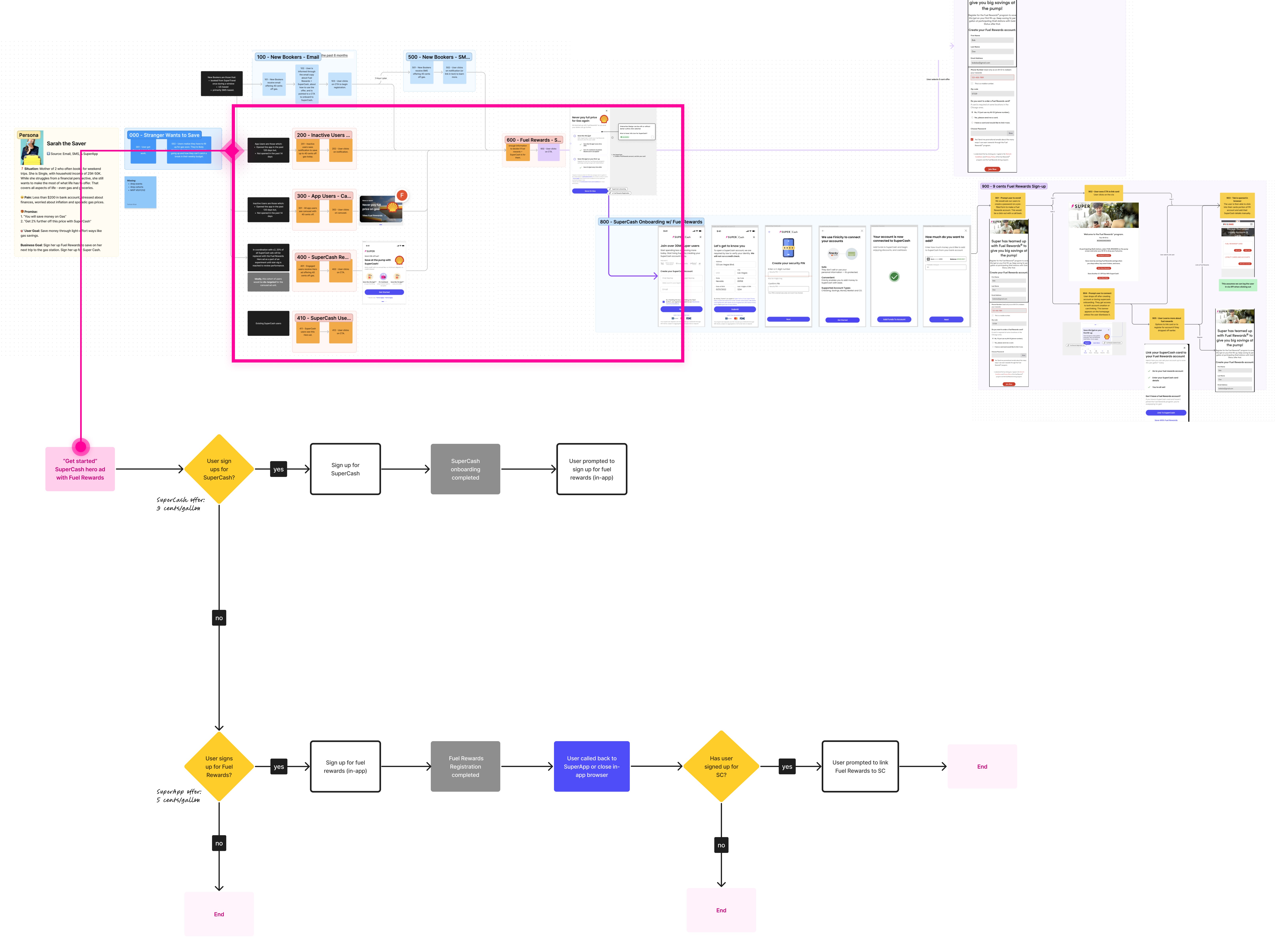
ARCHITECTING THE USER EXPERIENCE
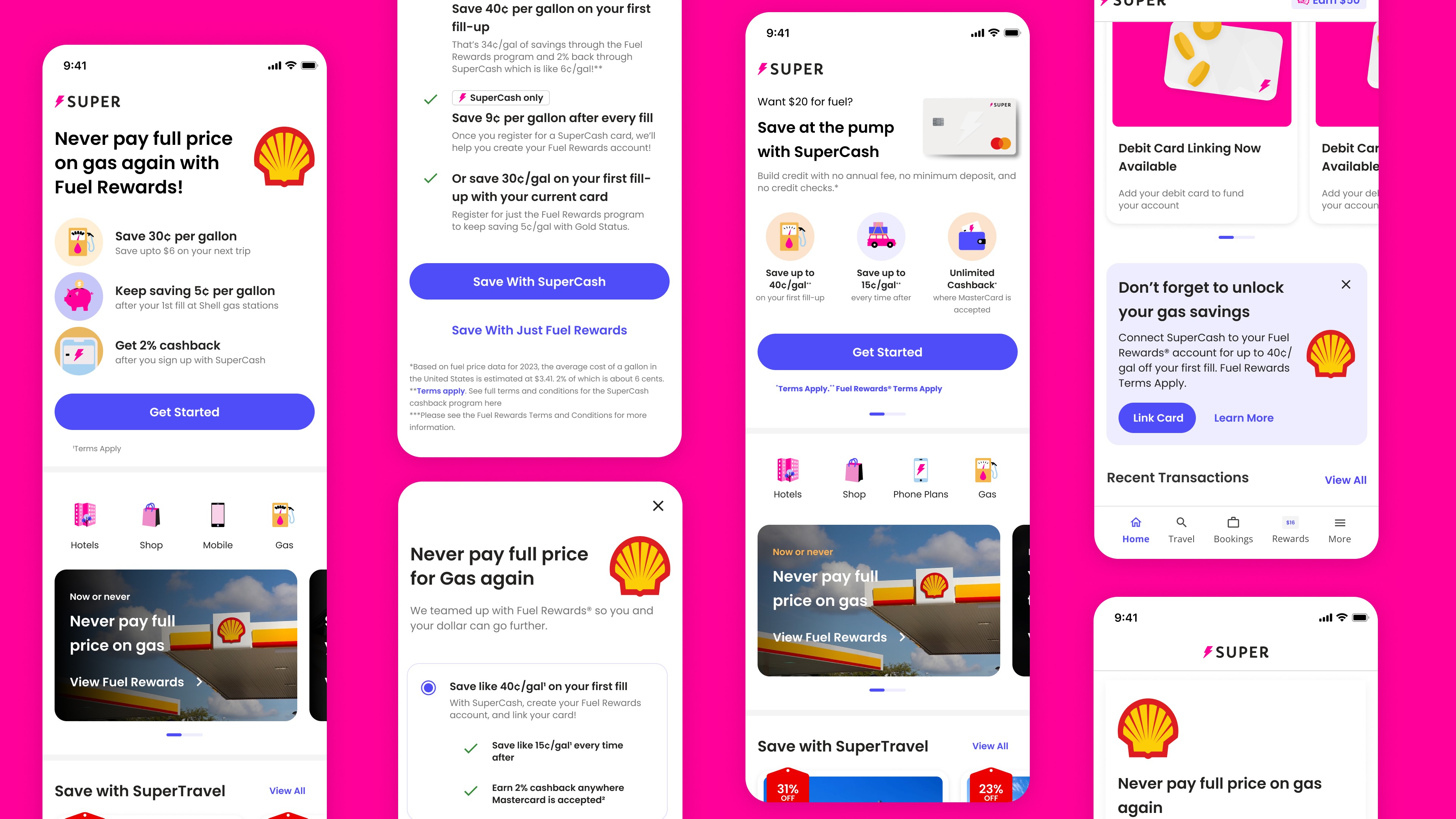
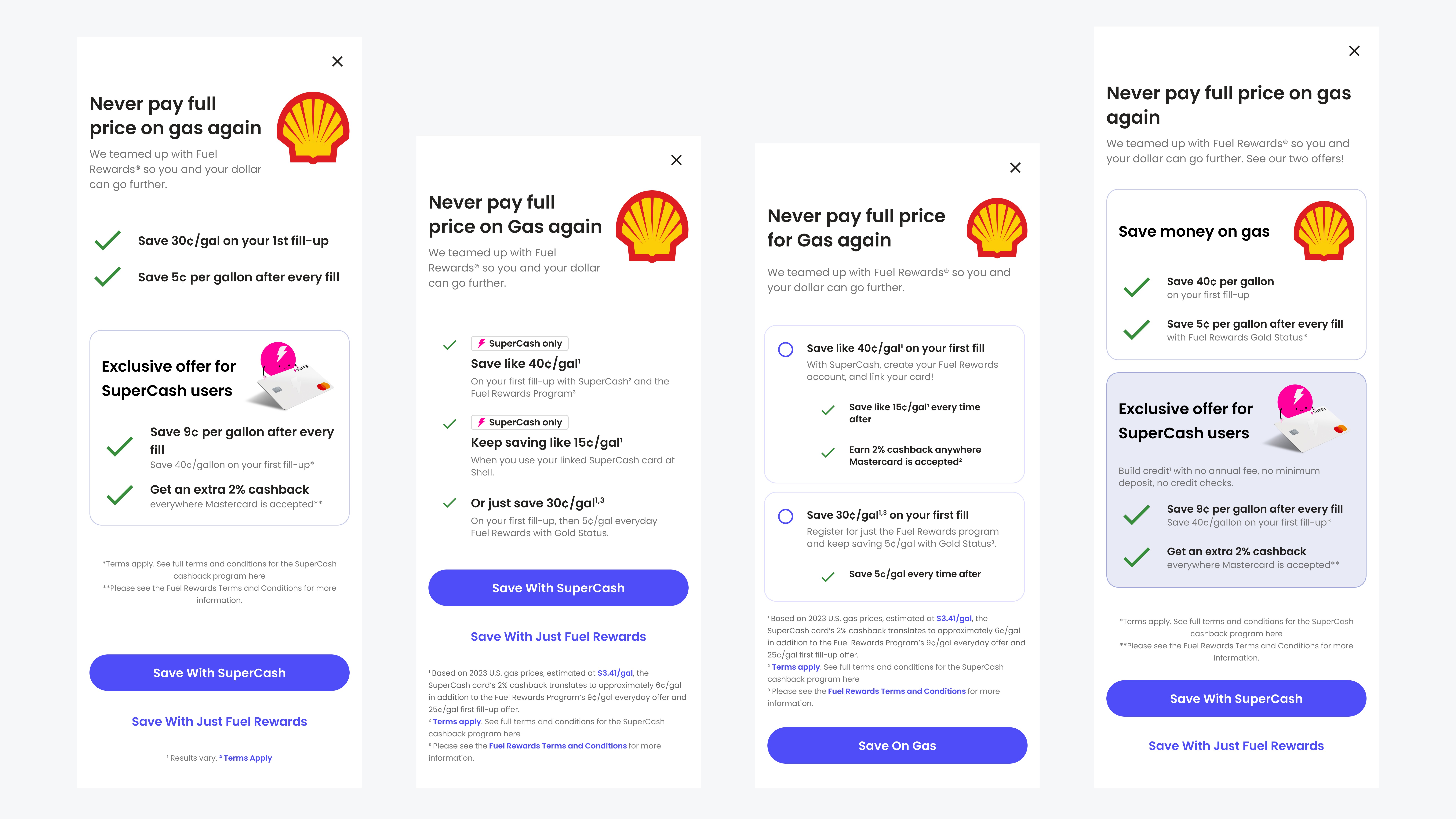
FIRST ITERATION
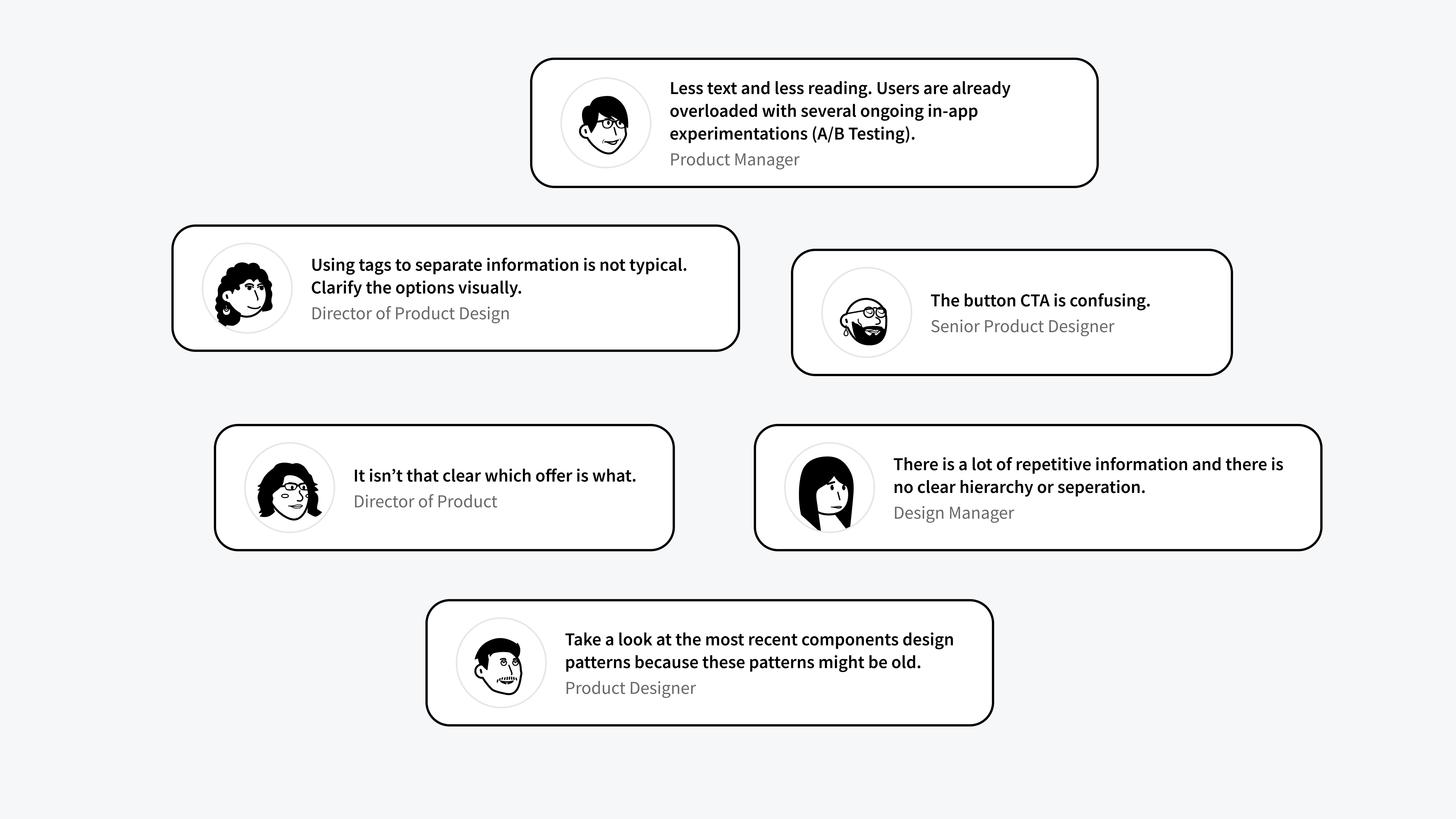
Internal feedback.
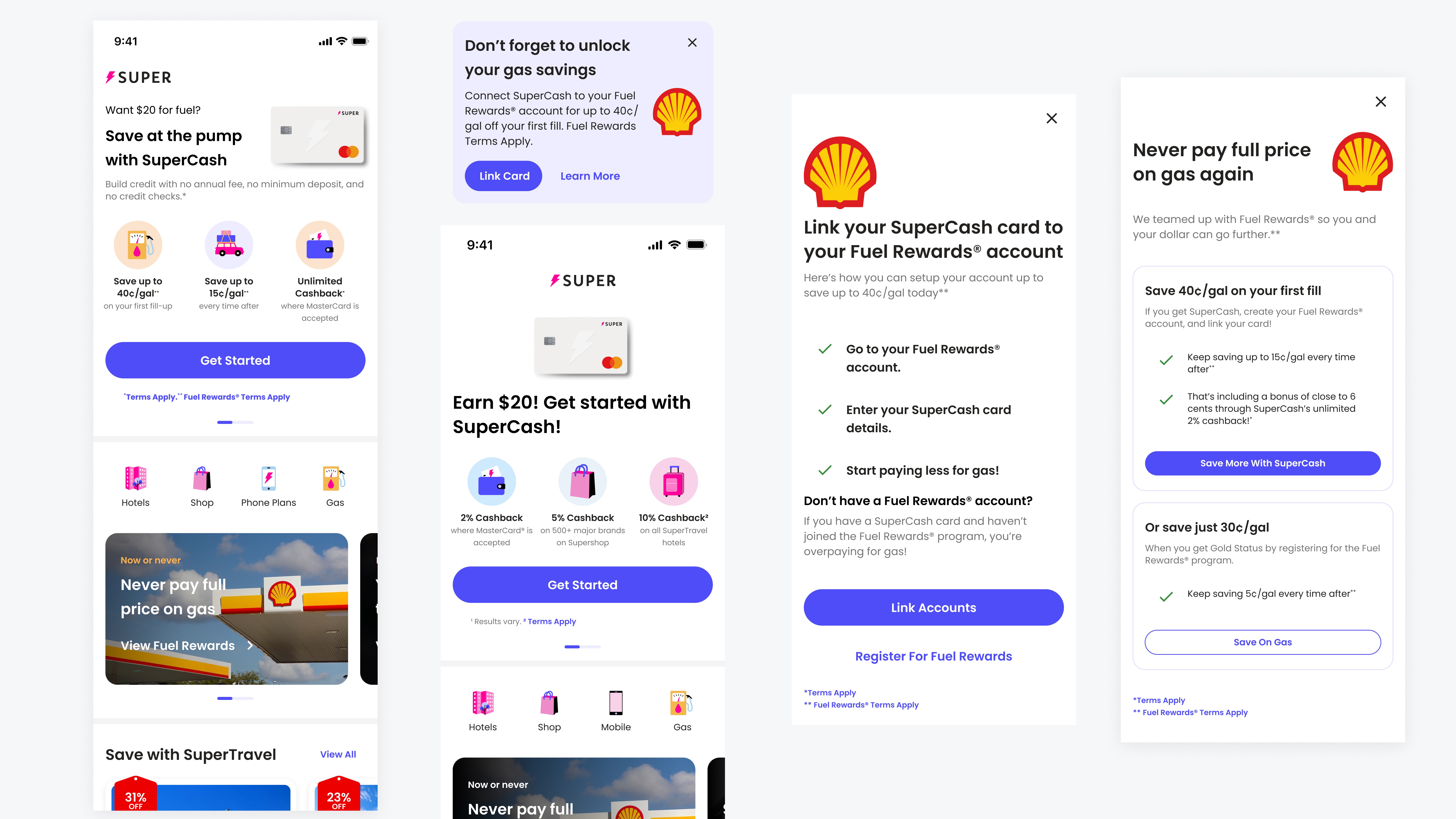
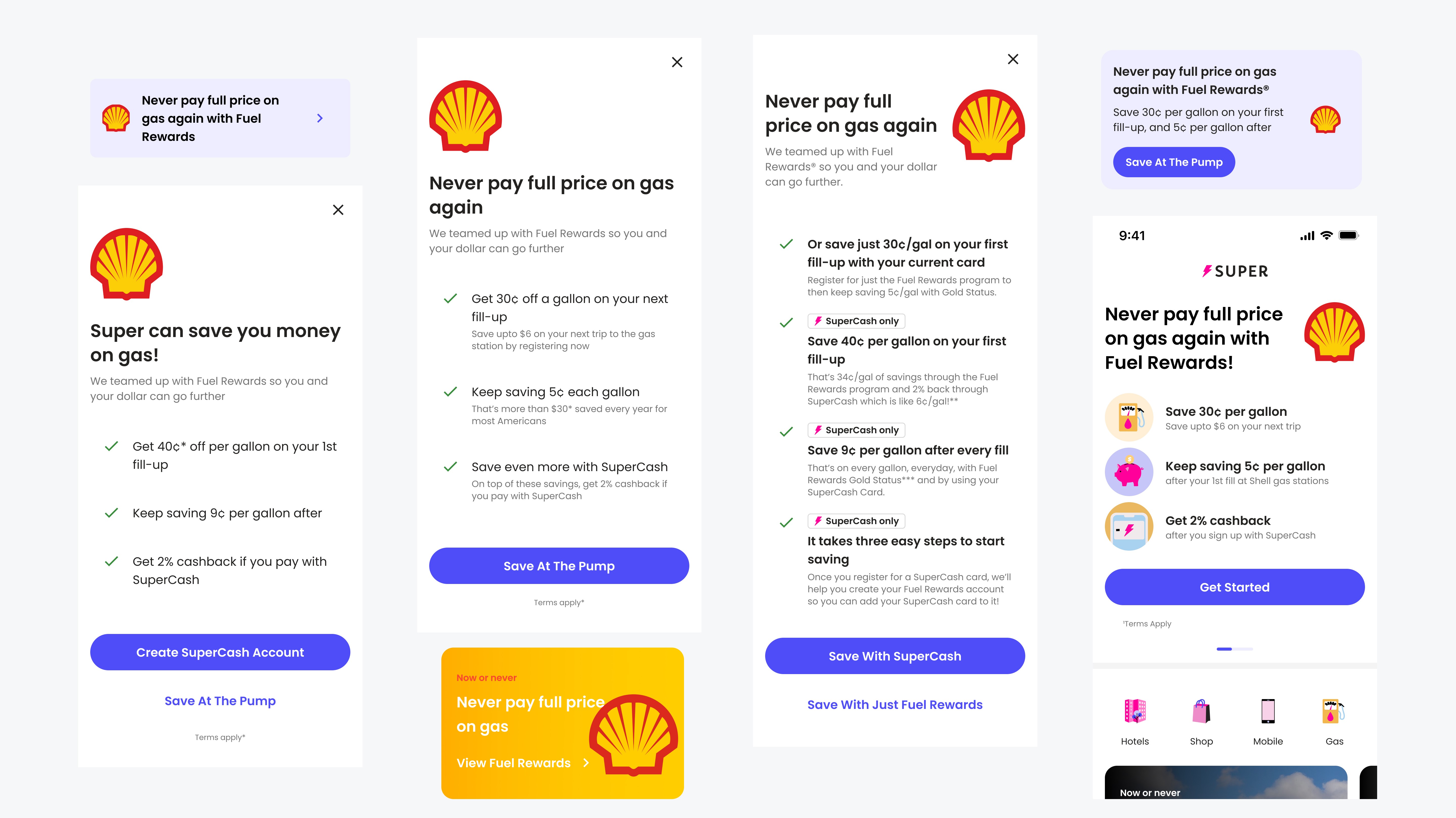
SECOND ITERATION
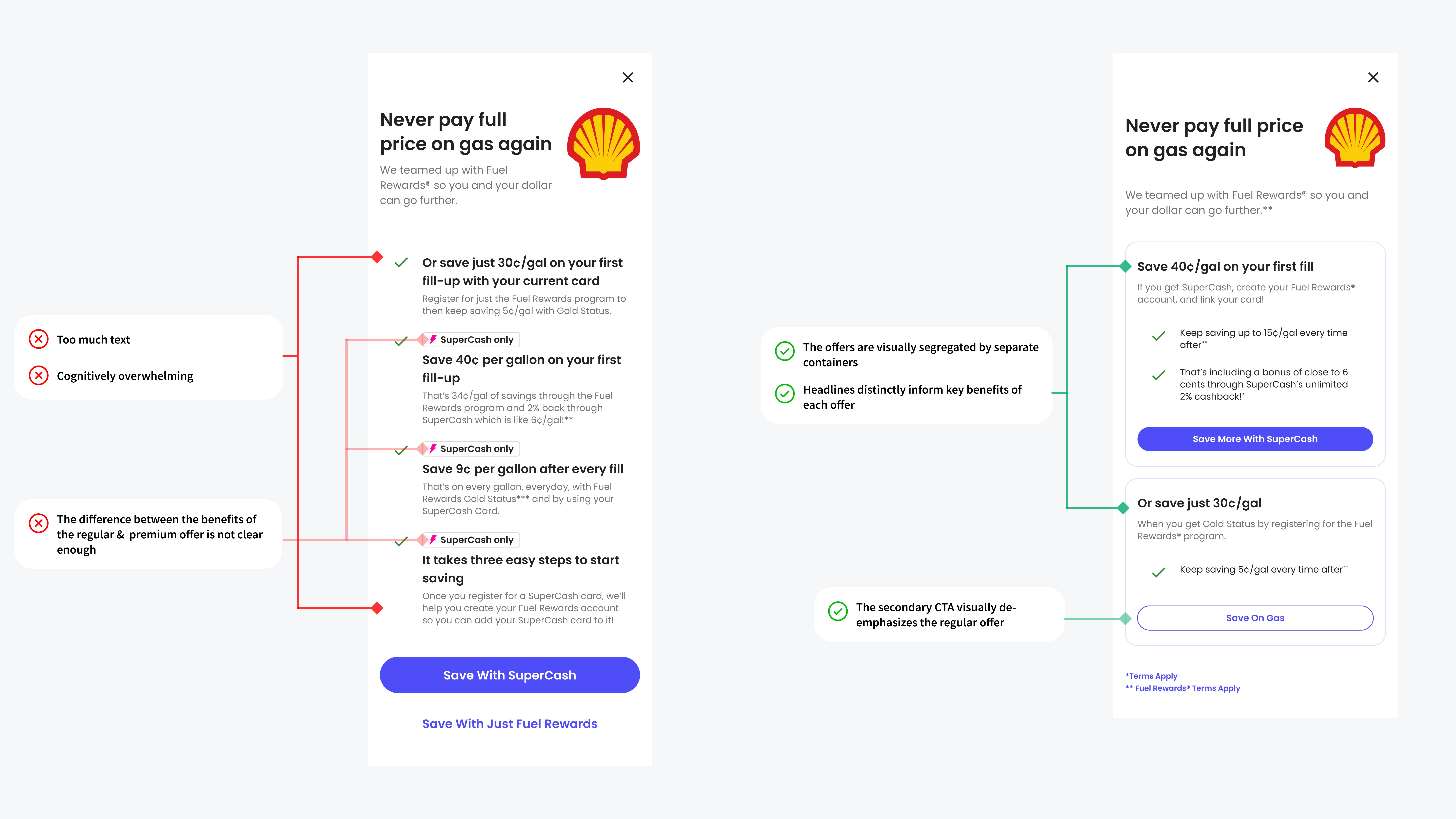
REFLECTION
Alignment on design assets was harder than I thought. I learned to balance feedback from managers, D-suites, and my personal voice and style as a designer.
LEARNINGS
Super valued choices and variety. Design reviews were an opportunity to showcase different approaches and to experiment. The design system was not set in stone and I had the opportunity work around Super's growing design system, Atlas.