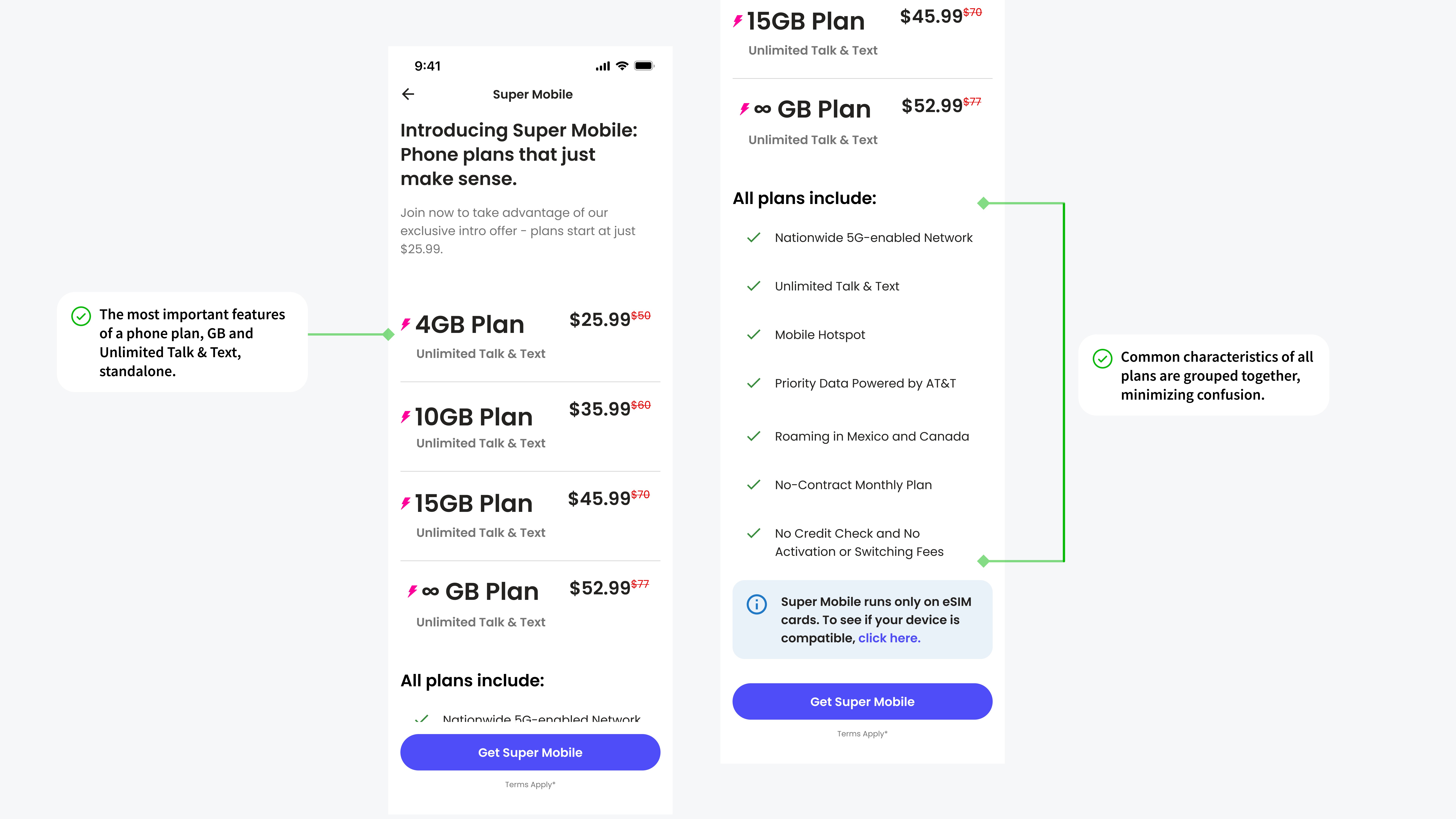
OUTCOME
DESIGN APPROACH
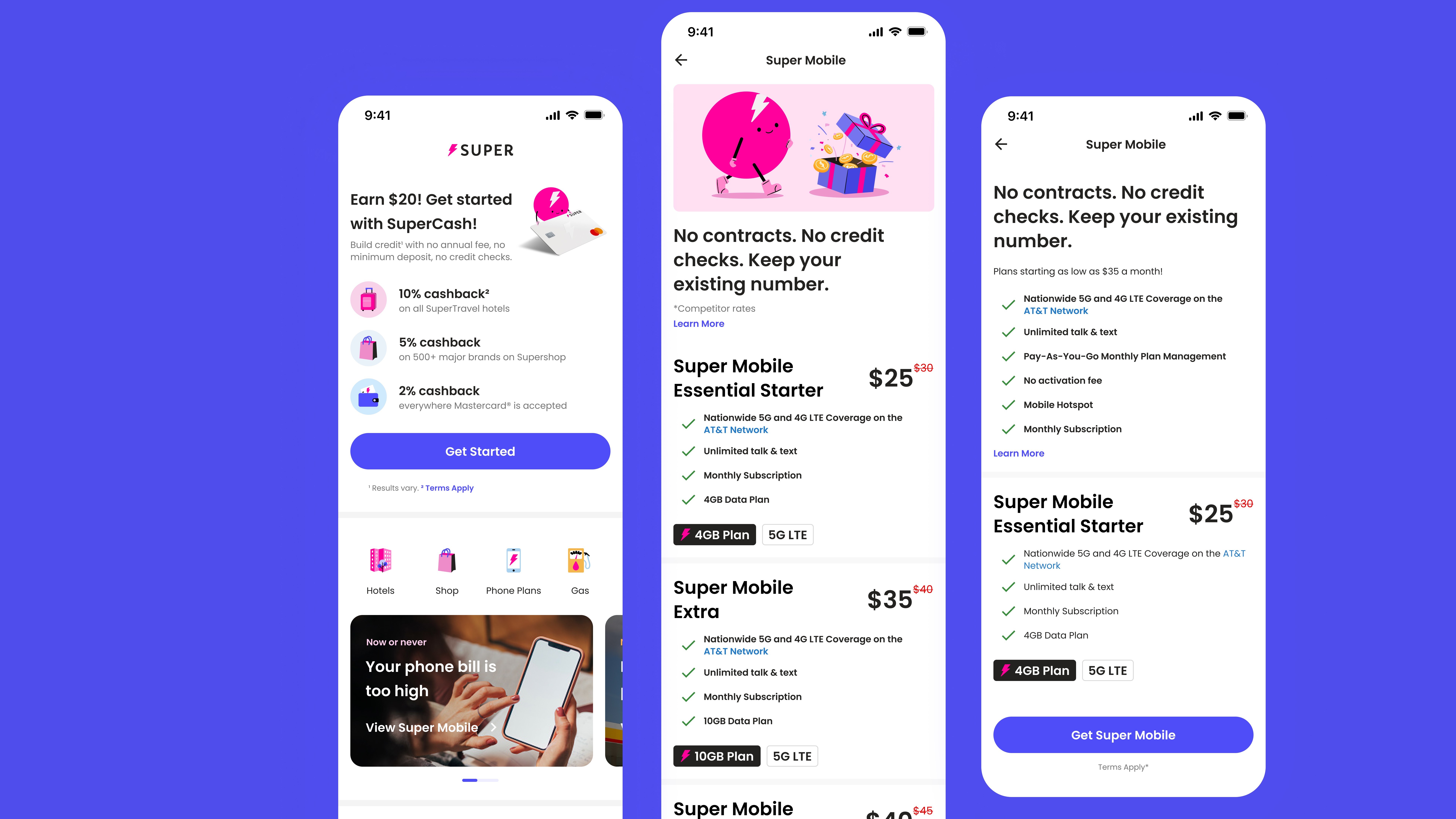
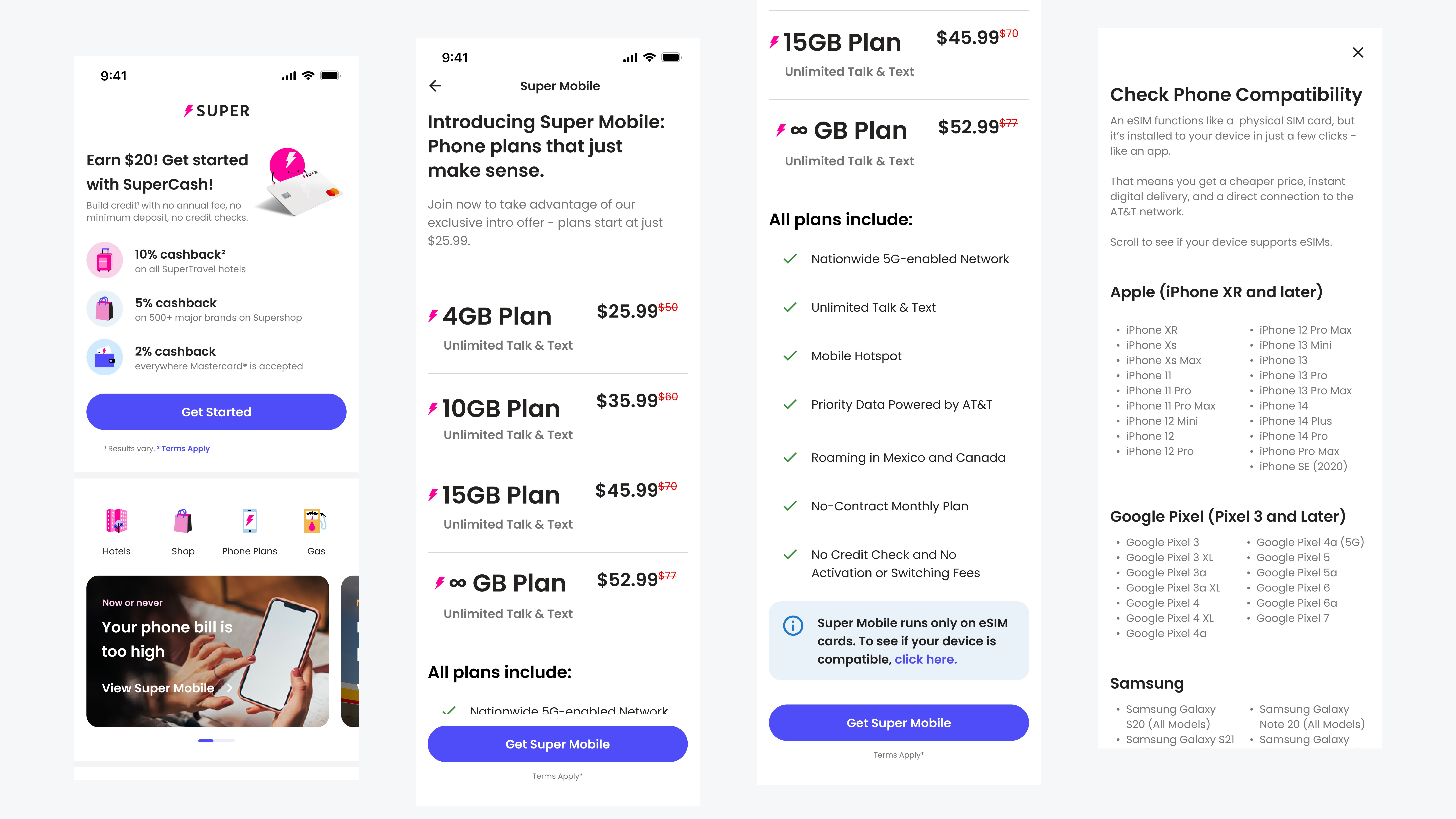
FIRST ITERATION
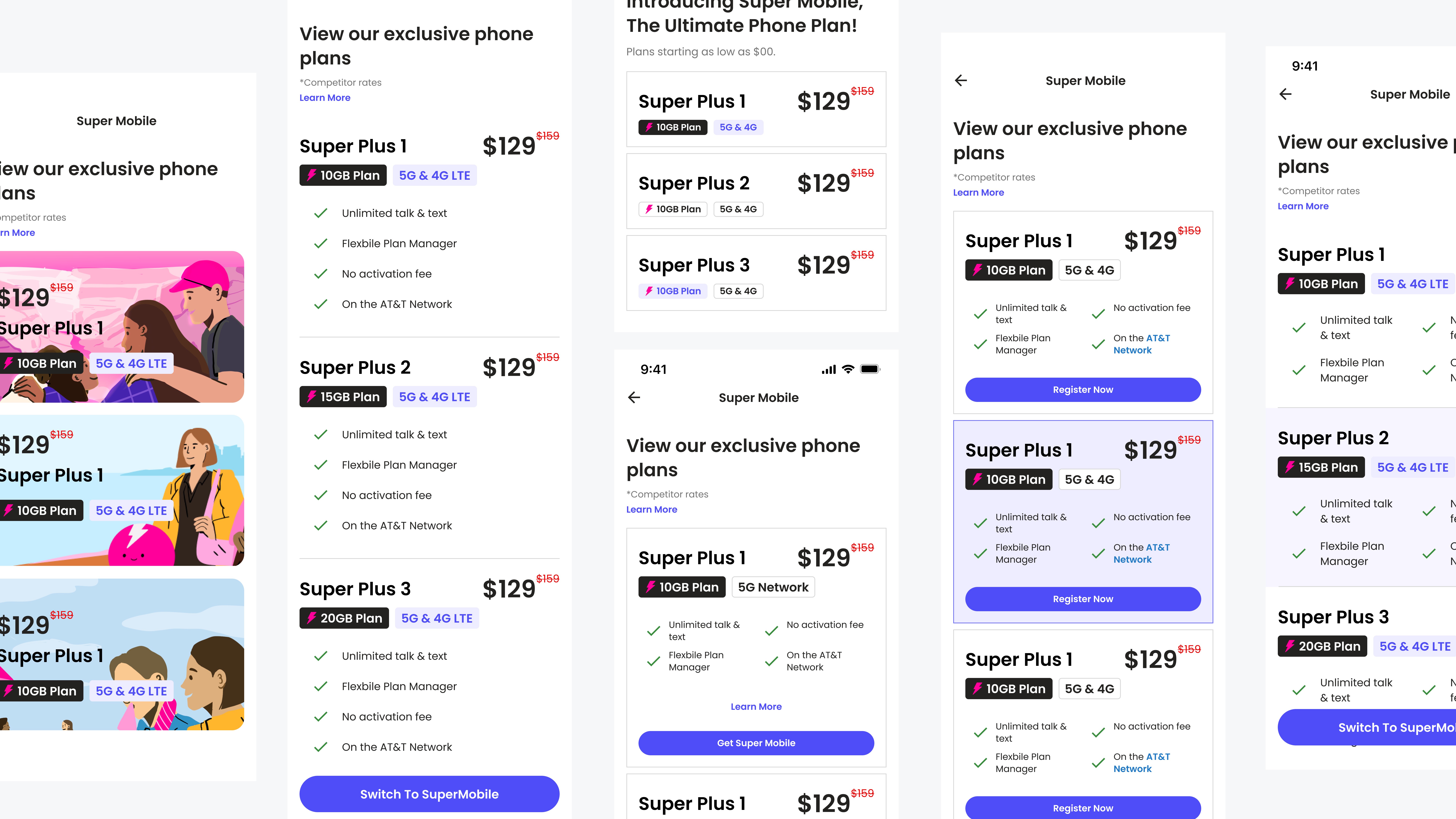
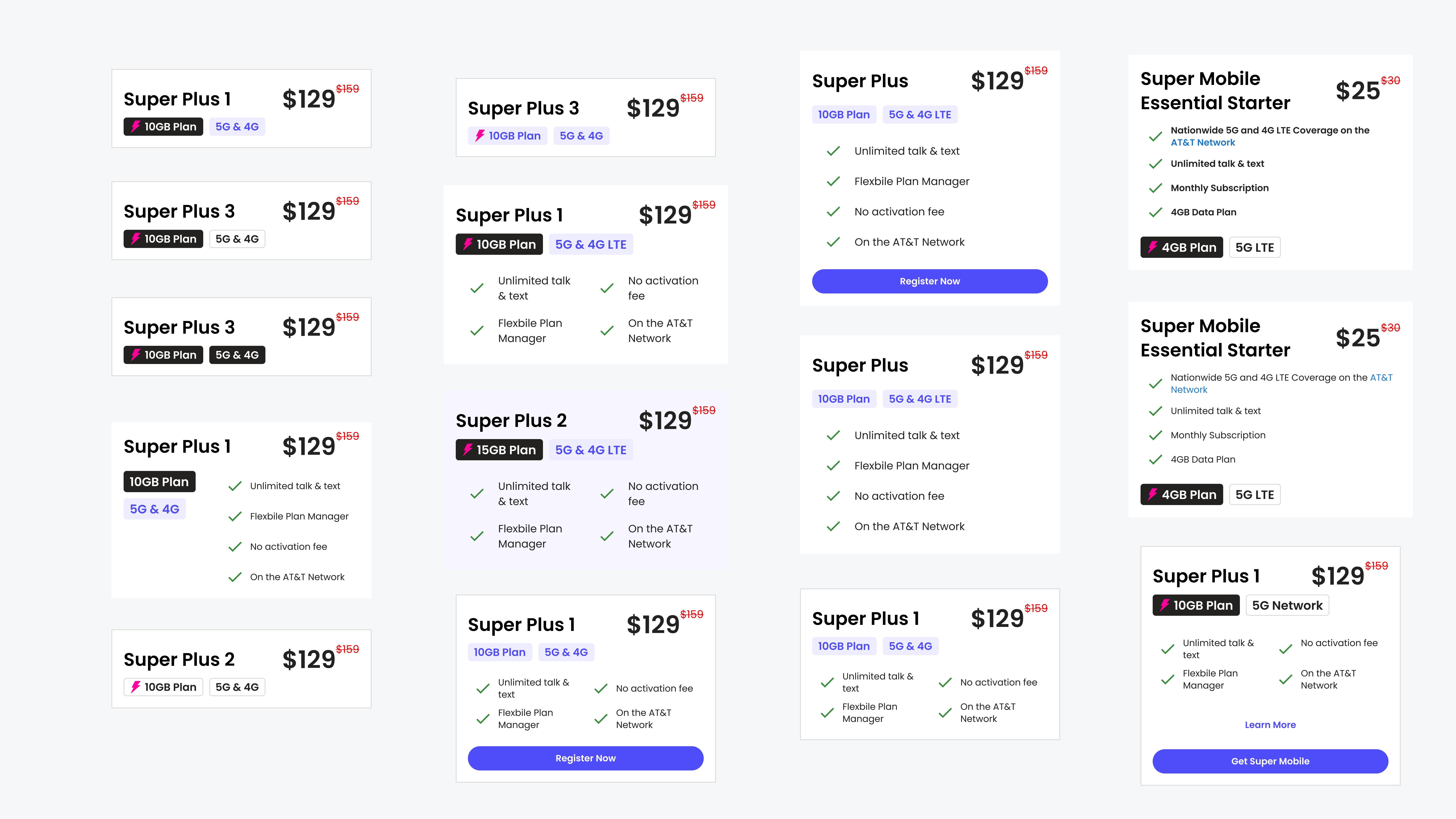
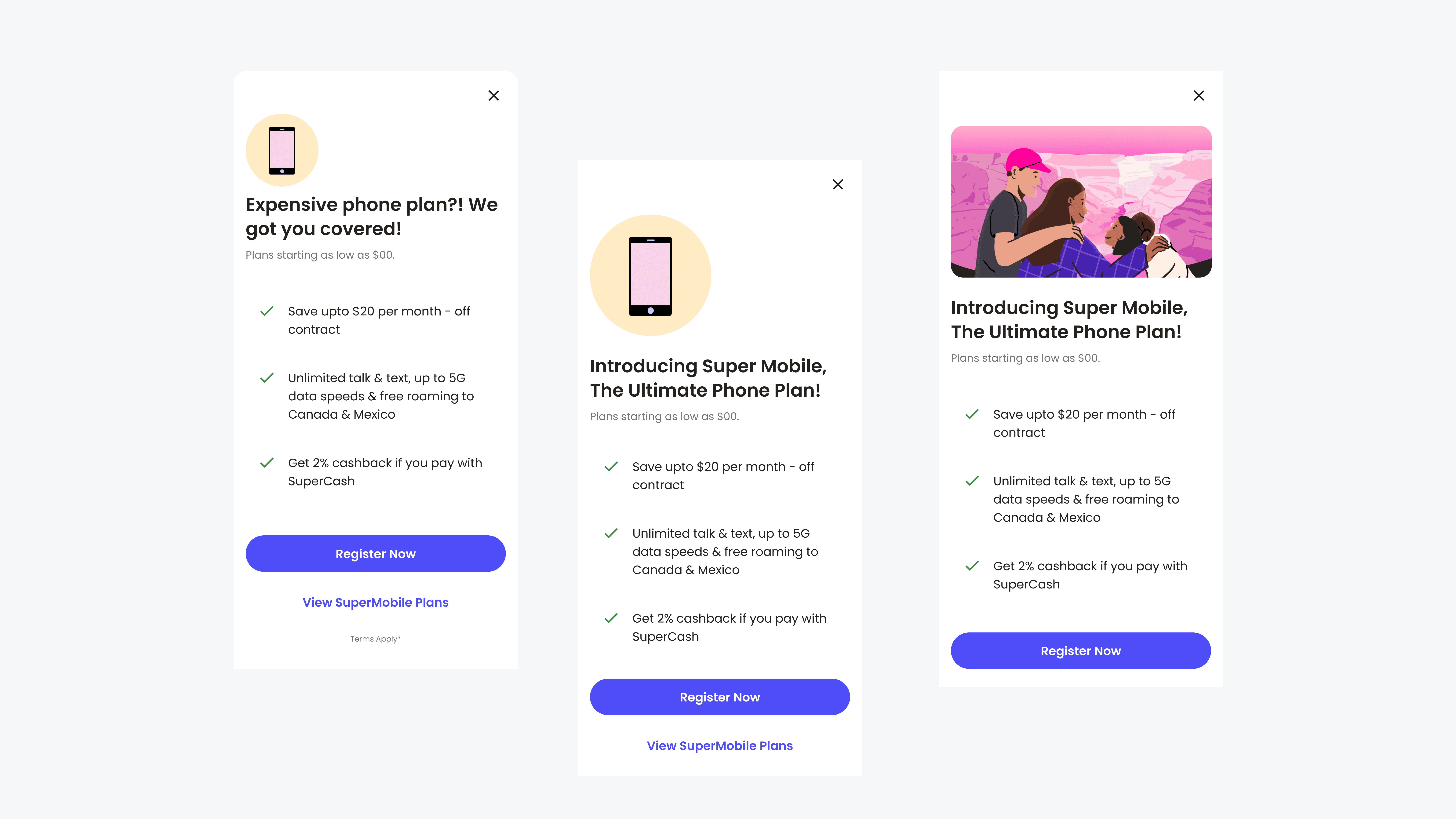
SECOND ITERATION
LEARNINGS
While non-design stakeholders may already have a solution in mind, my advocacy for user-centric design enhanced conversations with my peers, fostering greater collaboration and a fresher perspective.